
Reflect, one of Incision's web platforms, was designed to enhance the performance of medical residents by evaluating their surgical skills with help of AI.
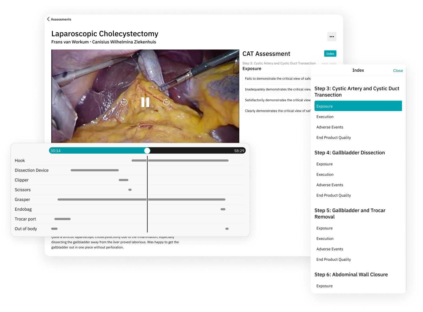
Within the Reflect web platform, users submit surgical procedure recordings for assessment. The system then analyzes the video, employing AI to identify the instruments used, their timing, and duration. This information is presented in a visual timeline format for each instrument, with highlighted timestamps, enabling users to easily navigate to specific segments in the video corresponding to each instrument's usage.

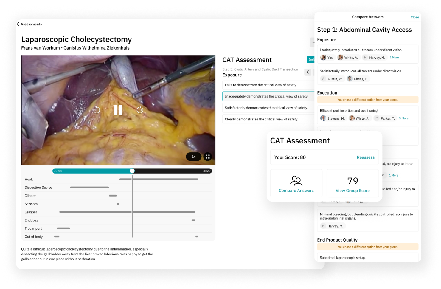
Users have the option to view surgical recordings alongside their colleagues, initiating internal discussions and receiving evaluations from their supervisors. The evaluation process involves completing a questionnaire within an internal assessment tool, which generates a score for comparison with their peers. Additionally, users can view areas where their responses differ from the group, serving as a valuable indicator for potential surgical skill enhancement.
Furthermore, users have the ability to conduct self-assessments and compare their self-evaluation results with those provided by their manager and the group.

My role as the UX designer in this project was conducting workshop sessions with key stakeholders to define business requirements and constraints, creating user journey and mind maps, creating the designs and building interactive prototypes.
The user interface was created based on their own design system. It was crucial to keep the same look and feel and reuse components as they are part of the same group of platforms and apps provided by the company.
From a design standpoint, creating a scalable user interface for the instrument timelines presented a significant challenge, given the potential for an unlimited number of items. My solution was to design a custom video control bar seamlessly integrated with the instrument timelines. This interface includes a prominent dark vertical line that offers users an at-a-glance view of concurrent instrument usage. This line is interactive, enabling users to click and drag it to a specific point in the video.
The 'Compare Answers' side sheet required some UX sessions with stakeholders to optimize the information structure, as it involves various hierarchical levels, including steps, sub-steps, user responses, and highlighted divergent answers. I opted to maintain the same structure as the questionnaire for steps and substeps, even though it meant additional scrolling on the sheet. This approach, however, ensures consistency with the assessment process. Additionally, unselected options are hidden, reducing the potential length of the sheet.
To streamline development and maintain consistency across Incision's platforms, I made the strategic decision to employ a pre-existing status banner to emphasize divergent answers.