
American Hotel is one of the largest hospitality suppliers in North America. I had the opportunity to work on a redesign project of the Product Details Page of their website.
I always appreciate working on ecommerce projects, especially for B2B businesses, due to its complexity and large number of variables. For example, a PDP can display multiple information for the same product, depending if the user is logged in or if the product is on sale, or out of stock, etc. There are multiple possibilities.
The marketing team identified a gap in the current user experience of the PDP. Users and Sales Reps were seeking essential product specifications elsewhere to share with their clients. A page redesign was necessary to incorporate this vital information for these users.
Initially, they wanted to redesign the product specifications table to incorporate a large amount of items in an easy-to-find and digestible way. The team saw this project as an opportunity to not only redesign a section but the whole Product Details Page and improve the user experience.
The project goal was to redesign the Product Details Page to include all product specifications, so users don't have to leave our website in order to view relevant data.
Eventually, the whole website will be redesigned, but starting with small changes to avoid confusion for the users.

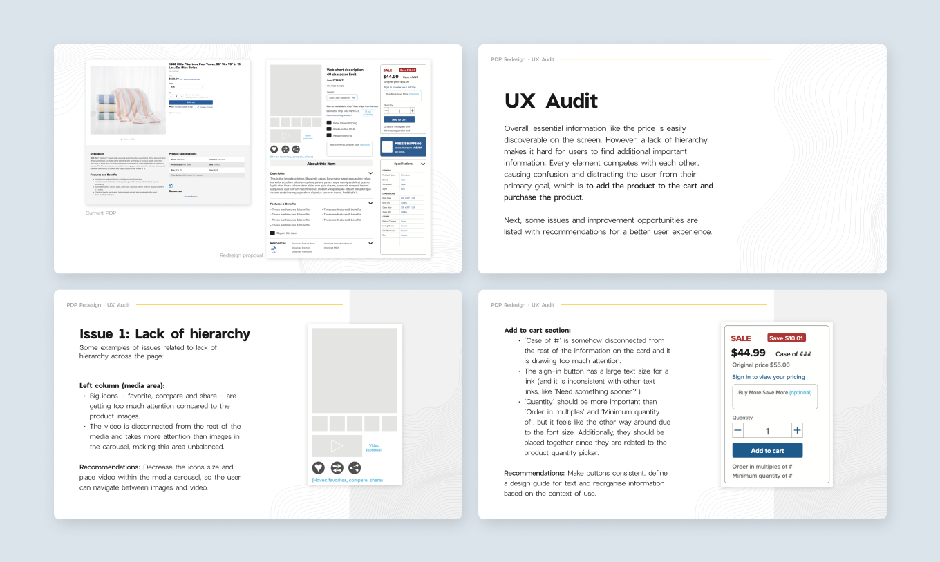
For this project, the marketing team had prepared a wireframe, but it was very different from the current design and experience, making the PDP inconsistent with the rest of the website. In addition, due to time constraints, they decided to validate their assumptions internally, so I did a quick high-level UX Audit of both the real live page and the mockup, making recommendations based on UX Design principles and best practices.
With the UX Audit I discovered some pain points for the users in the live version of the PDP and improvements opportunities in the mockup. To conclude the evaluation, I showed that with small changes on the current page in addition to some insights from the mockup we could not only solve some UX issues but even potentially improve the conversion rates.
So, I decided to focus on designing something between the live PDP and the mockup from the marketing team.
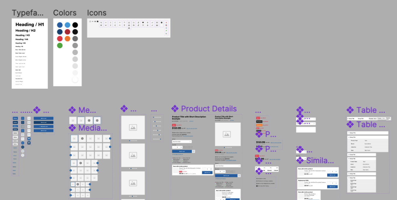
The company has no design team, hence no design system or any design file that I could possibly use. In order to speed up my process, I started building a style guide based on the UI from the American Hotel website.
I defined page layouts for different screen sizes, typeface for headings and body text, and primary, secondary and base colors. I created almost all icons from scratch, to make sure they have the same look and feel, but at the same time keeping consistency with the icons currently used in the platform.

I also created different components and some of them could be reused in other pages in the future. The most complex is the Product Details component, because it’s made of a combination of multiple nested components and each component has its own variants. It is complex, but it is also scalable because the designer can change components sizes, status, type, etc.
The style guide was made specifically for the Product Details Page, but of course, it should be used across the whole website design. It has potential to change into a more complete design system and could be published as a library to be used in different projects.
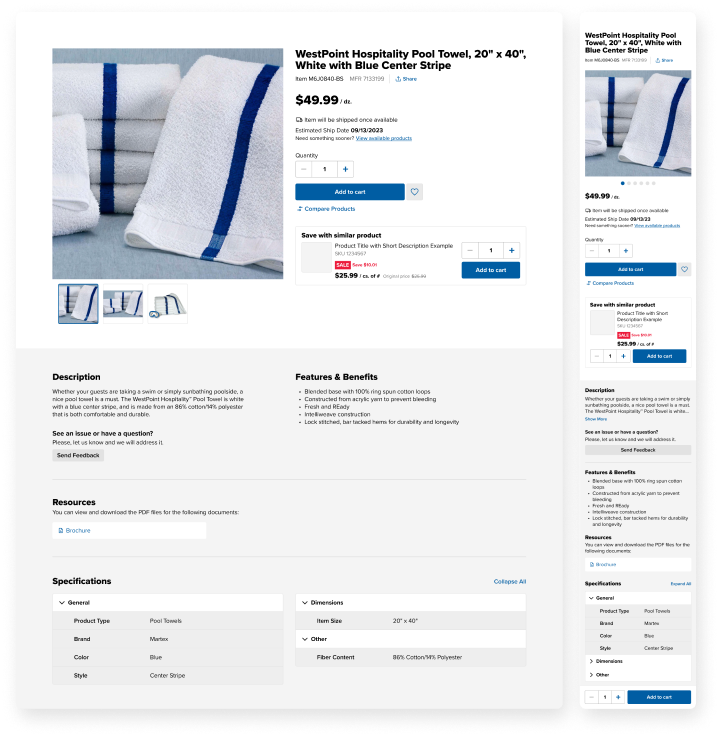
Below the new PDP design. I won't describe all changes, but I'd like to talk about some important design decisions I've made.

Initially, they wanted to redesign the product specifications table to incorporate a large amount of items in an easy-to-find and digestible way. The team saw this project as an opportunity to not only redesign a section but the whole Product Details Page and improve the user experience.
The project goal was to redesign the Product Details Page to include all product specifications, so users don't have to leave our website in order to view relevant data.
Eventually, the whole website will be redesigned, but starting with small changes to avoid confusion for the users.
I chose to keep the previous two-columns layout for the product details section, instead of 3 columns as proposed in the mockup. That way, all important information is grouped together in the same section and the user can easily scan what is relevant for them, facilitating the decision-making process.
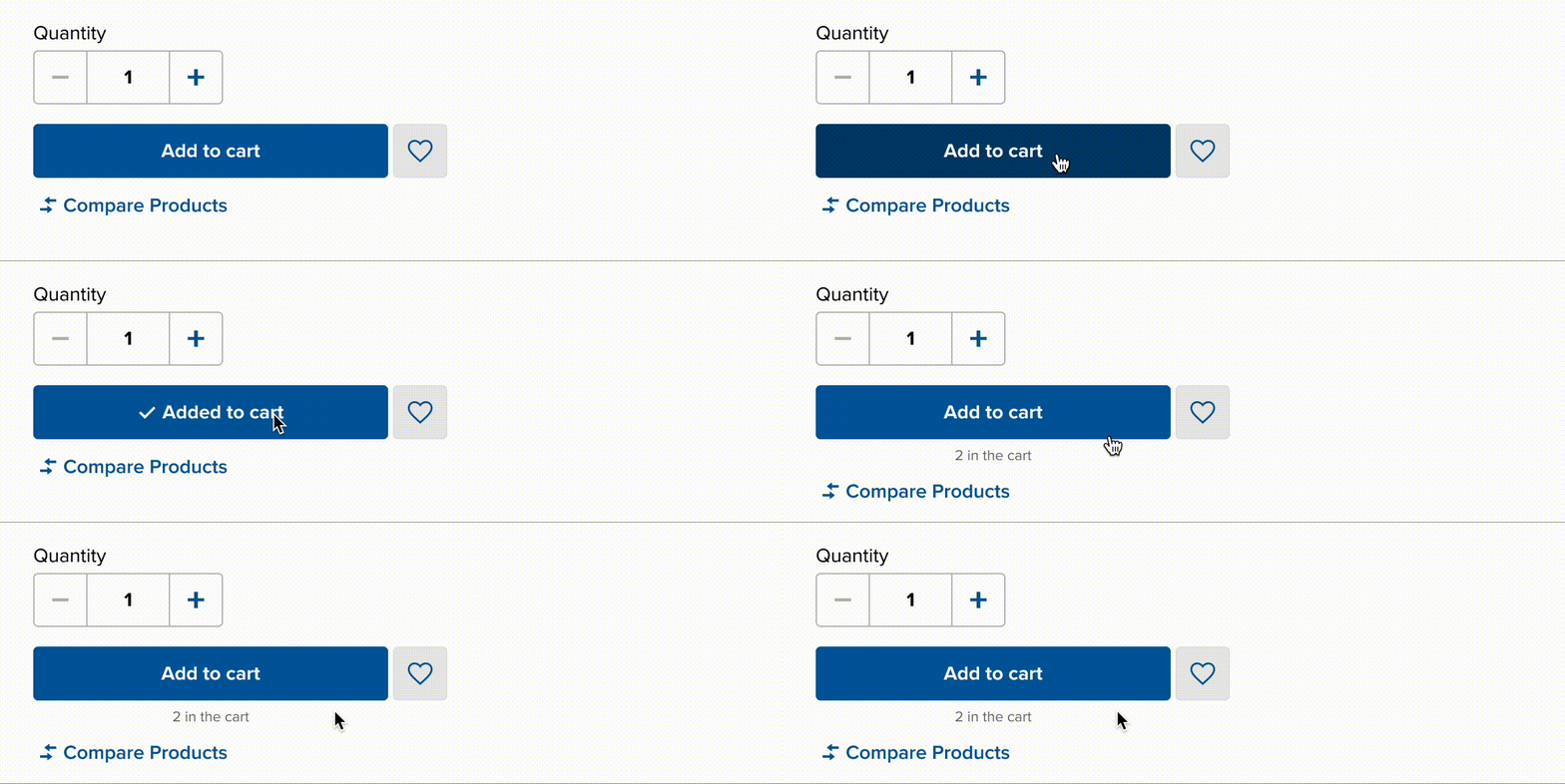
Another improvement was related to the 'Add to Cart' button, which now has a feedback message to the user. Before, after clicking on Add to Cart, the system displayed a confirmation banner on the top of the page for a couple of seconds. The problem was that users could easily miss this confirmation message. So, I designed a custom button only for 'Add to Cart', to incorporate the feedback on it.
As you can see below, once the user clicks on the button, its label changes to the confirmation message 'Added to Cart' for a couple of seconds and then changes it back to 'Add to Cart'. At the same time, the amount of items added to cart is displayed underneath the button.

Some ecommerce websites display a window with a list of products in the cart as a confirmation message plus a 'Proceed to Checkout' button. However, I avoid using windows because they distract users from their primary goals. In addition, users of the American Hotel website usually buy multiple items before they need to go to the checkout. Imagine if they had to close the confirmation window every time something was added to the cart!
Sticky Header With the new PDP a lot of new data will be added to the page, making it longer. Users will need to scroll more in order to read all product details and specifications, which means that they would need to scroll all the way back to the top if they decide to purchase the product after reading everything.
To avoid this scrolling back and forward, I designed a sticky header that should appear every time the Add to Cart button is no longer visible. That way, it doesn't matter in which page position the user makes the decision to buy the product: they can always click on Add to Cart.
Product Specifications That was the most challenging part due to the large amount of information that needed to be displayed.
Initially, I recommended not using an accordion list, as it hides information from users. However, that was the most scalable solution and it also decreased the length of the page, reducing scrolling. Additionally, on large screens, the table is divided into 2 columns.
We decided to keep the top accordions expanded by default to avoid hiding all information. Also, I added an Expand/ Collapse All button for users who may want to view everything at once, although this is actually an edge-case. Most likely, users who need to check the product specifications already know which particular spec they need to see, so the expected behavior is that they would open 1 or 2 accordion items.
For mobile devices, I recommend making the Specifications header sticky on the top of the page, so users don't need to scroll in order to Collapse All items.
Besides the specification table, I faced some other challenges like creating a complete product details component, taking into account all possible scenarios for all products and different states, shipping information, variables, etc.I also had to adapt some components to make them responsive without breaking the design. The sticky header, for example, changed into a fixed bottom bar in small screen sizes.
Overall, it was a really nice project and I could make important strategic design decisions. Although I was the only designer involved, I was always collaborating with other stakeholders to make sure everyone was on the same page.
For the next steps, after the redesign is implemented, we will validate it with users and iterate it, if needed. As mentioned before, this project will be used as a starting point for the redesign of the whole website.